Conversion starts with understanding the offer

A page converts better when it explains value fast, reduces doubt, shows proof, and makes the next step easy.
Supported byreduces doubt
Friction a polished page can hide
More visits do not fix a confusing offer. Conversion improves when users know what to do and why to trust.
How to review the full journey

Audit the page like a buyer: promise, clarity, evidence, speed, form, and follow-up.
Implementation checklist
- Check whether the H1 says what you sell and for whom.
- Make the primary CTA visible without clutter.
- Remove unnecessary form fields.
- Add proof, cases, guarantees, or process clarity.
- Confirm every lead enters follow-up.

A visible label explains what information each field needs.
Source · W3C WAI · Labeling Controls
Supported byspeed
What to measure after the fix
Measure conversion rate, form abandonment, CTA clicks, speed, lead quality, and effective contact rate.
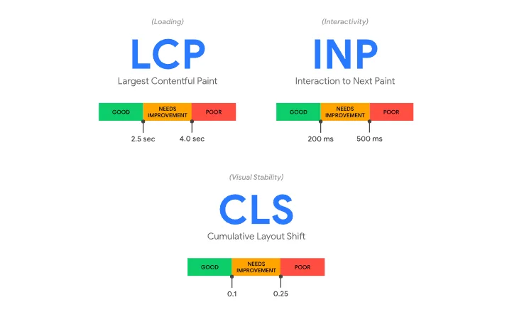
Loading, responsiveness and stability are reviewed separately in an audit.
Source · web.dev · Web Vitals
Find leaks by task, not decorations by page
A conversion audit starts with valuable tasks. Finding a service, comparing plans, submitting information, or completing payment. Reviewing an entire page without a task produces a list of opinions. Following the journey reveals missing information and unnecessary work.
First check whether the promise matches the traffic source. Then review comprehension, proof, effort, and error recovery. A larger button will not fix a hidden price or a condition that appears too late.
Prioritize problems by the number of people affected, severity, and correction cost. Save a screenshot and the data behind the decision. Without that evidence, the team will debate the same change again when a new person prefers a different visual answer.
Minimum path for a conversion audit
- Enter through search, an ad, and a direct link.
- Complete the primary task on desktop and mobile.
- Trigger form errors and verify that they can be corrected.
- Check messages, events, and response after conversion.
Supported byconversion optimization
Quick execution map
| Element | What to review | Quality signal |
|---|---|---|
| Intent | A page converts better when it explains value fast, reduces doubt, shows proof, and makes the next step easy. | The answer is clear within seconds. |
| Implementation | Audit the page like a buyer: promise, clarity, evidence, speed, form, and follow-up. | There is one concrete and assignable action. |
| Measurement | Measure conversion rate, form abandonment, CTA clicks, speed, lead quality, and effective contact rate. | The data should change a decision. A report with no action adds work. |
Frequently asked questions
What does website conversion checklist mean in practice?
A page converts better when it explains value fast, reduces doubt, shows proof, and makes the next step easy.
What is a sensible first step for website conversion checklist?
Check whether the H1 says what you sell and for whom. Then continue with this action: Make the primary CTA visible without clutter.
Which problem should website conversion checklist prevent?
More visits do not fix a confusing offer. Conversion improves when users know what to do and why to trust.
How do you measure progress with website conversion checklist?
Measure conversion rate, form abandonment, CTA clicks, speed, lead quality, and effective contact rate.