
Copy that helps people finish a purchase

Checkout UX writing reduces friction by clarifying what happens, what it costs, what data is requested, and how to fix errors.
Supported byhow to fix errors
Words that add doubt at checkout

Payment is a high-sensitivity moment. Any doubt about security, charges, or steps can stop the purchase.
How to write states, errors, and confirmations
Review every checkout screen and write short copy that prevents questions instead of explaining too late.
Implementation checklist
- Name plan, price, and currency clearly.
- Explain requested data and privacy when needed.
- Write actionable and human error messages.
- Confirm next steps after payment.
- Test copy against user feedback or support tickets.
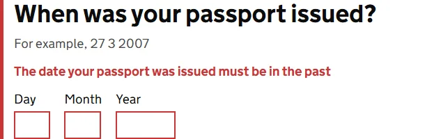
The error identifies the field and explains how to correct it.
Source · GOV.UK Design System
How to measure payment clarity
Measure step abandonment, form errors, payment attempts, support tickets, and completed payments.
Supported byform errors
Microcopy should explain consequences
In checkout, one word can change a decision. Continue does not say whether another step follows, a charge will occur, or review is still possible. A specific button reduces uncertainty: review order, go to payment, or confirm purchase. Precision matters more than cleverness.
Errors deserve the same care. Something went wrong forces people to guess. Identify the field that needs attention, keep what the person already entered, and explain how to fix it. When the system caused the problem, do not blame the user with impossible instructions.
Review the language around price, renewal, and cancellation too. Decisive information should appear before commitment with the same size and clarity as surrounding text. Hiding it may improve an immediate metric while multiplying support, refunds, and distrust later.
Words worth testing in context
- The button label at every payment step.
- Messages for declined cards, expired sessions, and incomplete data.
- Terms for charges, renewal, delivery, and cancellation.
- Final confirmation with amount, status, and next step.
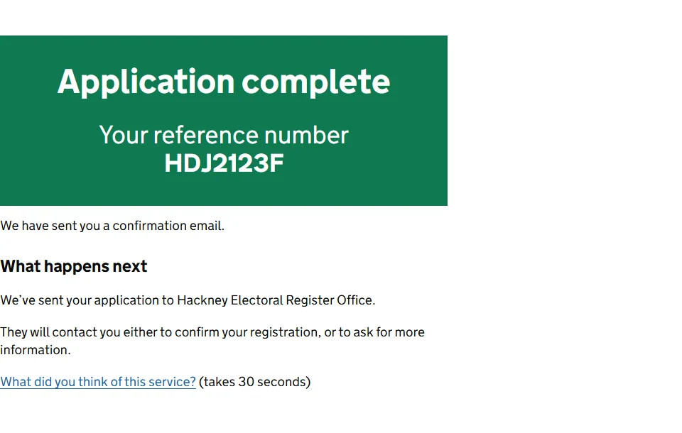
The confirmation combines status, a reference, and what happens next.
Source · GOV.UK Design System
Supported bycheckout usability
Quick execution map
| Element | What to review | Quality signal |
|---|---|---|
| Intent | Checkout UX writing reduces friction by clarifying what happens, what it costs, what data is requested, and how to fix errors. | The answer is clear within seconds. |
| Implementation | Review every checkout screen and write short copy that prevents questions instead of explaining too late. | There is one concrete and assignable action. |
| Measurement | Measure step abandonment, form errors, payment attempts, support tickets, and completed payments. | The data should change a decision. A report with no action adds work. |
Frequently asked questions
What does UX writing for checkout mean in practice?
Checkout UX writing reduces friction by clarifying what happens, what it costs, what data is requested, and how to fix errors.
What is a sensible first step for UX writing for checkout?
Name plan, price, and currency clearly. Then continue with this action: Explain requested data and privacy when needed.
Which problem should UX writing for checkout prevent?
Payment is a high-sensitivity moment. Any doubt about security, charges, or steps can stop the purchase.
How do you measure progress with UX writing for checkout?
Measure step abandonment, form errors, payment attempts, support tickets, and completed payments.